
Bring your website to life with a responsive web design.
Responsive websites are websites that can be viewed on any device. Page widths, colours, links, texts, graphics, and videos all adjust automatically to fit the size and shape of whatever screen it’s viewed on — from a large HD monitor to a small phone screen. With responsive website design services, you can ensure that your website features the tools and content you need to grow your organisation
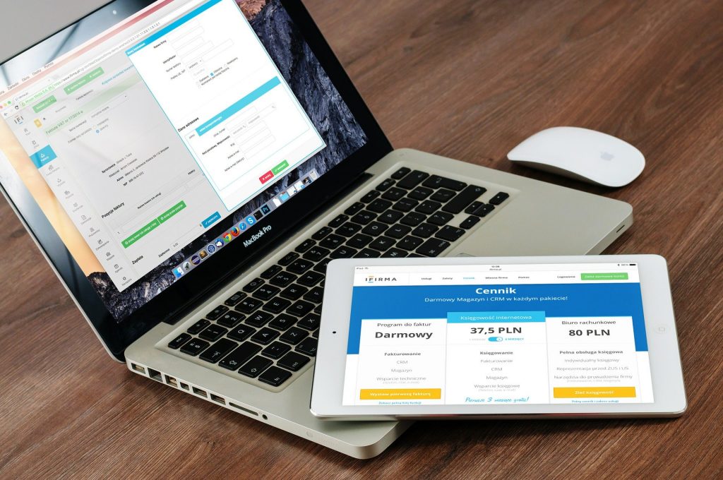

With responsive web design services, you eliminate the need for multiple codes for separate webpages and sites for different computers, smartphones, and tablets. On large monitors, there’s no loss of resolution, so the images and graphics are as crisp and clear as if viewed on a mobile device. Your brand stays intact across all devices, ensuring that every webpage displays and operates as intended on every screen, every time.